


CSS 布局与视觉效果常用实践指南
在我一篇随笔中其实有说到十大布局,里面有提到 flex 布局、grid 布局、响应式布局,不过没有提到容器查询这个,现在说下这三个布局然后穿插下容器查询把。
1️⃣ 核心布局方案
🧩 Flexbox 弹性布局

适用场景:线性布局、动态内容对齐,例如按钮组、导航栏、商品卡片列表
.navbar {
  display: flex;
  justify-content: space-between;
  align-items: center;
  gap: 1.5rem;
  flex-wrap: wrap;

  @media (max-width: 768px) {
    flex-direction: column;
  }
}
Grid 网格布局
适用场景:二维布局、复杂排列
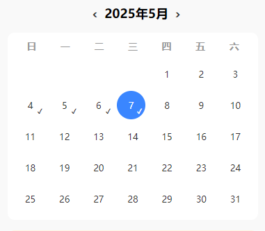
应用场景:日历打卡、微信服务页面九宫格布局
.calendar {
  display: grid;
  grid-template-columns: repeat(7, 1fr);
  gap: 8px;
}

.grid-menu {
  display: grid;
  grid-template-columns: repeat(3, 1fr);
  gap: 12px;
}
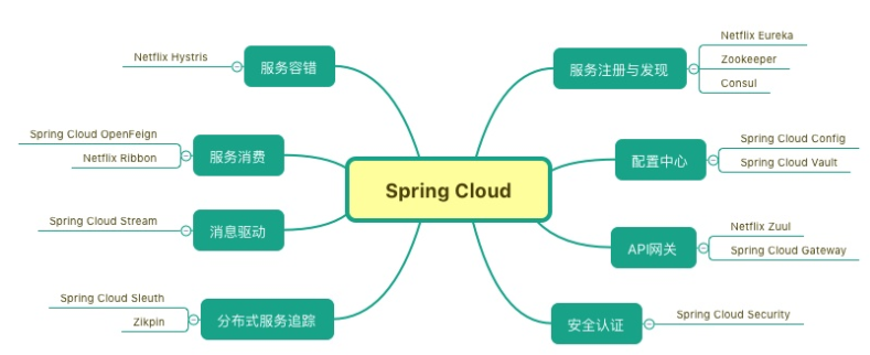
容器查询(Container Queries)
![图片[1]-CSS 魔法与布局技巧-牛翰网](https://niuimg.niucores.com/wp-content/uploads/2025/05/2691180622477780041.jpg)
组件根据容器大小自适应,而非整个视口
应用场景:嵌套组件(如卡片、图表容器)
.card-container {
  container-type: inline-size;
  container-name: card;
}

.card {
  @container card (width < 800px) {
    .desc {
      font-size: 12px;
    }
  }
}
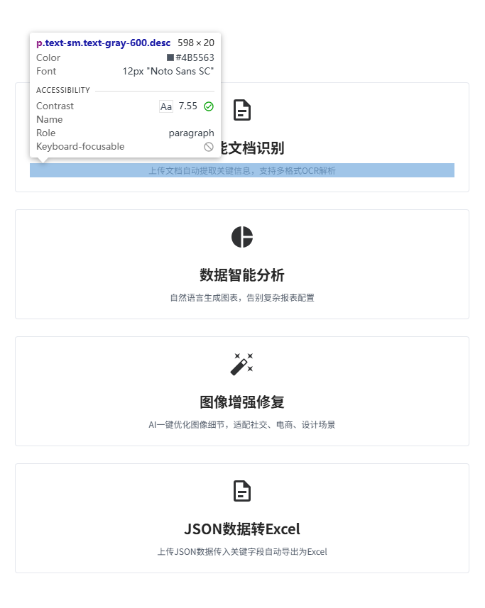
媒体查询(Media Queries)
图片如上
适用场景:针对屏幕尺寸、设备类型进行响应式调整
应用场景:整体页面布局、字体、间距适配
$breakpoints: (
  desktop: 1200px,
  tablet: 768px,
  mobile: 480px,
);

.card-container {
  display: grid;
  grid-template-columns: repeat(3, 1fr);
  gap: 1.5rem;
  padding: 2rem;

  @media (max-width: map-get($breakpoints, tablet)) {
    grid-template-columns: 1fr;
    padding: 1.5rem;
  }

  @media (max-width: map-get($breakpoints, mobile)) {
    padding: 1rem;
  }
}
2️⃣ 高级视觉效果
玻璃拟态(Glassmorphism)
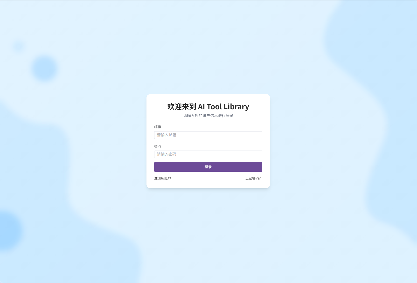
应用场景:用户信息卡片、登录弹窗背景等
.glass-panel {
  background: linear-gradient(
    135deg,
    rgba(255, 255, 255, 0.15) 0%,
    rgba(255, 255, 255, 0.05) 100%
  );
  backdrop-filter: blur(12px) saturate(160%);
  border: 1px solid rgba(255, 255, 255, 0.2);
  border-radius: 16px;
  box-shadow: 0 8px 32px rgba(0, 0, 0, 0.1), inset 0 4px 12px rgba(255, 255, 255, 0.2);

  @supports not (backdrop-filter: blur()) {
    background: rgba(255, 255, 255, 0.9);
  }
}
视差滚动(Parallax)
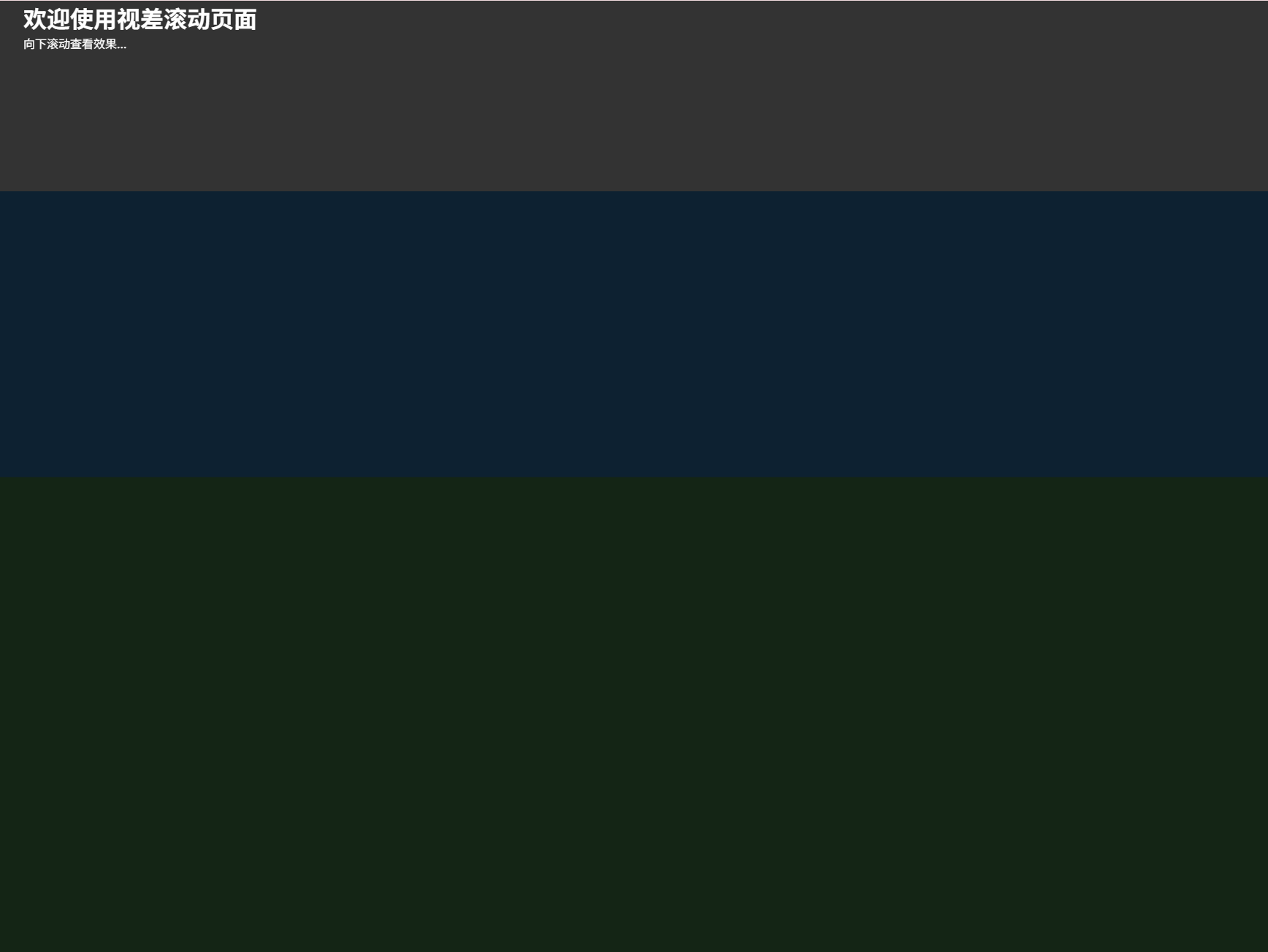
应用场景:活动页背景、Banner 页面动效
<div class="parallax-layer layer-1" data-speed="0.2"></div>
<div class="parallax-layer layer-2" data-speed="0.5"></div>

<div class="content">
  <h1>视差滚动</h1>
  <p>向下滚动查看效果...</p>
</div>
const layers = document.querySelectorAll(".parallax-layer");

function updateParallax() {
  const scrollY = window.scrollY;
  layers.forEach((layer) => {
    const speed = parseFloat(layer.dataset.speed);
    const offset = scrollY * speed;
    layer.style.transform = `translateY(${offset}px)`;
  });
}

window.addEventListener("scroll", updateParallax);
window.addEventListener("load", updateParallax);
* {
  margin: 0;
  padding: 0;
  box-sizing: border-box;
}

body,
html {
  height: 100%;
  font-family: sans-serif;
}

.parallax-layer {
  position: fixed;
  top: 0;
  left: 0;
  width: 100%;
  height: 100vh;
  background-size: cover;
  background-position: center;
  will-change: transform;
}

.layer-1 {
  background-color: #42a5f5;
  z-index: 1;
}

.layer-2 {
  background-color: #66bb6a;
  z-index: 2;
}

.content {
  position: relative;
  z-index: 3;
  min-height: 200vh;
  padding: 100vh 2rem 2rem;
  background: rgba(0, 0, 0, 0.8);
  color: white;
}
3️⃣ 响应式设计策略
自适应布局策略
优先使用弹性布局 + SCSS 嵌套媒体查询 + 相对单位
| 单位 | 适用场景 | 示例 |
|---|---|---|
| rem | 字体/边距 | font-size: 1.2rem |
| vw/vh | 视口宽高 | width: 100vw |
| % | 相对父元素 | width: 50% |
| ch | 文本宽度限制 | max-width: 60ch |
.container {
  --gutter: clamp(1rem, 3vw, 2rem);
  padding-inline: var(--gutter);
  max-width: 1440px;
  margin: 0 auto;

  @media (width < map-get($breakpoints, tablet)) {
    grid-template-columns: 1fr;
  }
}
4️⃣ 实验性特性前瞻
️ CSS Houdini 自定义绘制
应用场景:粒子背景、按钮涟漪效果、可控图案
// 加载模块
CSS.paintWorklet.addModule('circle-painter.js');

// 使用样式
.element {
  background-image: paint(circlePainter);
  --circle-color: #ff4757;
  --circle-size: 8;
}
// circle-painter.js
registerPaint(
  "circlePainter",
  class {
    static get inputProperties() {
      return ["--circle-color", "--circle-size"];
    }

    paint(ctx, size, props) {
      const count = parseInt(props.get("--circle-size"));
      const color = props.get("--circle-color").toString();

      ctx.fillStyle = color;
      for (let i = 0; i < count; i++) {
        ctx.beginPath();
        ctx.arc(
          Math.random() * size.width,
          Math.random() * size.height,
          4,
          0,
          2 * Math.PI
        );
        ctx.fill();
      }
    }
  }
);
5️⃣ 最佳实践总结
推荐方案
- 布局策略:Flexbox / Grid → 容器查询 → 媒体查询
- 单位选择:rem / vw → % → 固定 px(仅特殊场景)
- 视觉效果:渐进增强,提供降级处理
- 代码维护:SCSS 嵌套 + 设计变量系统 + CSS 变量
避免事项
- 过度使用
!important - 🧱 超过 3 层的选择器嵌套
- 固定宽高组合使用(不利响应)
- 重复定义断点逻辑
来源链接:https://www.cnblogs.com/zxlh1529/p/18863229
© 版权声明
本站所有资源来自于网络,仅供学习与参考,请勿用于商业用途,否则产生的一切后果将由您(转载者)自己承担!
如有侵犯您的版权,请及时联系3500663466#qq.com(#换@),我们将第一时间删除本站数据。
如有侵犯您的版权,请及时联系3500663466#qq.com(#换@),我们将第一时间删除本站数据。
THE END


暂无评论内容