


抖音爆火—可爱俏皮的软件卸载提示页面制作
前言
前两天在抖音刷到了一个很可爱的软件卸载页面,鼠标滑动还会变脸,很萌很可爱,所以想着自己也做一个,花了一下午时间总算写了出来,总体效果还可以,哈哈
效果展示
制作过程
语言用的前端三件套:HTML+CSS+JS,制作过程并不难,会复制粘贴就行。
OK,那我们开始吧…
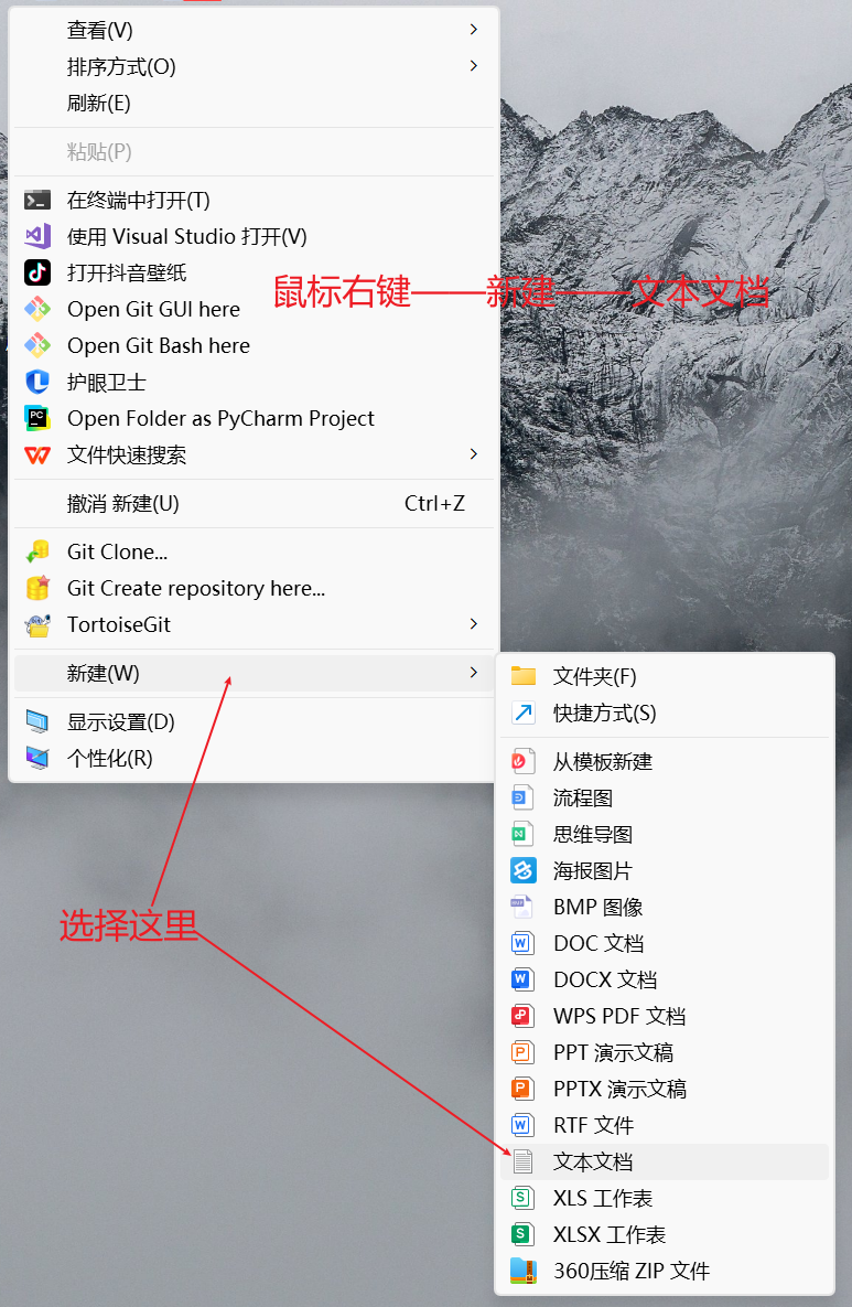
首先,新建一个文本文档,将以下代码复制进去,保存(CTRL+S)并关闭
代码
<!DOCTYPE html>
<html lang="zh-CN">
<head>
    <meta charset="UTF-8">
    <title>软件卸载</title>
    <style>
        body {
            display: flex;
            justify-content: center;
            align-items: center;
            height: 100vh;
            margin: 0;
            background-color: rgb(5 4 4 / 50%);
            font-family: system-ui, -apple-system, sans-serif;
        }

        .dialog {
            background-color: #dad5d5;
            padding: 40px;
            border-radius: 8px;
            text-align: center;
            width: 500px;
            box-shadow: 0 2px 12px rgba(0, 0, 0, 0.1);
            position: relative;
            padding-top: 50px;
        }

        .title {
            color: #333; /* 修改标题颜色 */
            margin: 0;
            font-size: 13px;
            font-weight: normal;
            position: absolute;
            top: 0;
            left: 0;
            right: 0;
            padding: 6px 0;
            background-color: #f5f5f5;
            border-top-left-radius: 8px;
            border-top-right-radius: 8px;
            border-bottom: 1px solid #e0e0e0;
            text-align: center;
        }

        .title b {
            display: inline-block;
            position: relative;
        }

        .window-controls {
            position: absolute;
            left: 8px;
            top: 50%;
            transform: translateY(-50%);
            display: flex;
            gap: 6px;
        }

        .window-control {
            width: 12px;
            height: 12px;
            border-radius: 50%;
        }

        .close {
            background-color: #ff5f56;
        }

        .minimize {
            background-color: #ffbd2e;
        }

        .maximize {
            background-color: #27c93f;
        }

        .question {
            margin: 25px 0;
            font-size: 16px;
            color: #333;
        }

        .emoji {
            width: 180px;
            height: 180px;
            background: radial-gradient(circle at center 45%, #fff3b8 0%, #ffd86b 60%);
            margin: 30px auto;
            border-radius: 50%;
            position: relative;
            transition: all 0.3s ease;
        }

        .eyes {
            display: flex;
            justify-content: center;
            gap: 20px;
            padding-top: 45px;
        }

        .eye {
            width: 52px;
            height: 52px;
            background-color: white;
            border-radius: 50%;
            position: relative;
            box-shadow: inset 0 2px 4px rgba(0, 0, 0, 0.1);
        }

        .eye::before {
            content: '';
            position: absolute;
            width: 30px;
            height: 30px;
            background-color: #513f35;
            border-radius: 50%;
            top: 50%;
            left: 50%;
            transform: translate(-50%, -50%) translate(var(--pupil-x, 0), var(--pupil-y, 0));
        }

        /* 新增眉毛样式 */
        .eyebrow {
            width: 50px;
            height: 10px;
            background-color: #513f35;
            position: absolute;
            top: 25px;
            border-radius: 5px;
            transition: all 0.3s ease;
        }

        .eyebrow.left {
            left: 25px;
            transform: rotate(-10deg);
        }

        .eyebrow.right {
            right: 25px;
            transform: rotate(10deg);
        }

        /* 新增脸颊红晕样式 */
        .blush {
            width: 20px;
            height: 10px;
            background-color: #ff9999;
            border-radius: 50%;
            position: absolute;
            top: 100px;
            opacity: 0;
            transition: all 0.3s ease;
        }

        .blush.left {
            left: 20px;
        }

        .blush.right {
            right: 20px;
        }

        .mouth {
            width: 75px;
            height: 42px;
            background-color: #d84b37;
            border-radius: 15px;
            margin: 25px auto;
            position: relative;
            transition: all 0.3s ease;
        }

        /* 新增牙齿样式 */
        .tooth {
            width: 18px;
            height: 10px;
            background-color: white;
            position: absolute;
            right: 21px;
            top: 0px;
            border-bottom-left-radius: 5px;
            border-bottom-right-radius: 5px;
        }

        /* 开心表情的嘴巴样式 */
        .emoji.happy .mouth {
            width: 60px;
            height: 30px;
            border-radius: 0 0 30px 30px;
            background-color: #d84b37;
        }

        /* 难过表情的嘴巴样式 */
        .emoji.sad .mouth {
            width: 60px;
            height: 30px;
            border-radius: 30px 30px 0 0;
            background-color: #d84b37;
        }

        /* 开心表情的眉毛样式 */
        .emoji.happy .eyebrow.left {
            transform: rotate(10deg);
        }

        .emoji.happy .eyebrow.right {
            transform: rotate(-10deg);
        }

        /* 开心表情的脸颊红晕样式 */
        .emoji.happy .blush {
            opacity: 1;
        }

        /* 难过表情的眉毛样式 */
        .emoji.sad .eyebrow.left {
            transform: rotate(-20deg);
        }

        .emoji.sad .eyebrow.right {
            transform: rotate(20deg);
        }

        /* 难过表情的脸颊红晕样式 */
        .emoji.sad .blush {
            opacity: 0.5;
        }

        /* 定义开心表情的动画 */
        @keyframes happyAnimation {
            0% {
                transform: scale(1);
            }
            25% {
                transform: scale(1.1);
            }
            50% {
                transform: scale(1.05);
            }
            75% {
                transform: scale(1.1);
            }
            100% {
                transform: scale(1);
            }
        }

        /* 定义难过表情的动画 */
        @keyframes sadAnimation {
            0% {
                transform: translateY(0);
            }
            25% {
                transform: translateY(7px);
            }
            50% {
                transform: translateY(5px);
            }
            75% {
                transform: translateY(7px);
            }
            100% {
                transform: translateY(0);
            }
        }

        /* 应用开心表情动画 */
        .emoji.happy {
            animation: happyAnimation 0.8s ease;
        }

        /* 应用难过表情动画 */
        .emoji.sad {
            animation: sadAnimation 0.8s ease;
        }

        /* 新增渐变绿色样式 */
        .emoji.green-transition {
            background: radial-gradient(circle at center 100%, #FFD86B 30%, #5ea585 95%);
            transition: background 1s ease;
        }

        /* 呆呆表情的样式 */


        .emoji.dull .mouth {
            width: 40px;
            height: 5px;
            border-radius: 5px;
            background-color: #666;
        }

        .emoji.dull .eyebrow.left,
        .emoji.dull .eyebrow.right {
            transform: rotate(0deg);
        }

        .buttons {
            display: flex;
            justify-content: space-between;
            padding: 0;
            margin: 40px -20px -20px -20px;
        }

        button {
            padding: 8px 25px;
            border: none;
            border-radius: 10px;
            color: white;
            cursor: pointer;
            font-size: 16px;
            font-weight: 500;
            transition: box-shadow 0.3s ease; /* 添加过渡效果 */
        }

        button:hover {
            box-shadow: 0 2px 8px rgba(0, 0, 0, 0.2); /* 鼠标悬停时添加阴影 */
        }

        .keep {
            margin-left: 20px;
            background-color: #67b239;
        }

        .uninstall {
            margin-right: 20px;
            background-color: #c15548;
        }
    </style>
</head>
<body>
    <div class="dialog">
        <h3 class="title">
            <div class="window-controls">
                <div class="window-control close"></div>
                <div class="window-control minimize"></div>
                <div class="window-control maximize"></div>
            </div>
            <b>软件卸载</b>
        </h3>
        <div class="question">是否确实要卸载软件?</div>
        <div class="emoji">
            <!-- 新增眉毛 -->
            <div class="eyebrow left"></div>
            <div class="eyebrow right"></div>
            <div class="eyes">
                <div class="eye"></div>
                <div class="eye"></div>
            </div>
            <!-- 新增脸颊红晕 -->
            <div class="blush left"></div>
            <div class="blush right"></div>
            <div class="mouth">
                <!-- 新增牙齿 -->
                <div class="tooth"></div>
            </div>
        </div>
        <div class="buttons">
            <button class="keep">保留</button>
            <button class="uninstall">卸载</button>
        </div>
    </div>
    <script>
        document.addEventListener('mousemove', (e) => {
            const eyes = document.querySelectorAll('.eye');

            eyes.forEach(eye => {
                const eyeRect = eye.getBoundingClientRect();
                const eyeCenterX = eyeRect.left + eyeRect.width / 2;
                const eyeCenterY = eyeRect.top + eyeRect.height / 2;

                // 计算鼠标和眼睛中心的角度
                const angle = Math.atan2(e.clientY - eyeCenterY, e.clientX - eyeCenterX);

                // 限制眼球移动的半径
                const distance = 8;

                // 计算眼球的新位置
                const x = Math.cos(angle) * distance;
                const y = Math.sin(angle) * distance;

                // 更新眼球位置
                eye.style.setProperty('--pupil-x', `${x}px`);
                eye.style.setProperty('--pupil-y', `${y}px`);
            });
        });

        // 获取表情和按钮元素
        const emoji = document.querySelector('.emoji');
        const keepButton = document.querySelector('.keep');
        const uninstallButton = document.querySelector('.uninstall');
        const dialog = document.querySelector('.dialog');

        // 定义防抖函数,避免频繁触发表情更新
        function debounce(func, delay) {
            let timer;
            return function() {
                const context = this;
                const args = arguments;
                clearTimeout(timer);
                timer = setTimeout(() => {
                    func.apply(context, args);
                }, delay);
            };
        }

        // 鼠标进入保留按钮时切换为开心表情
        keepButton.addEventListener('mouseenter', debounce(() => {
            emoji.classList.add('happy');
            emoji.classList.remove('sad');
            emoji.classList.remove('green-transition');
            emoji.classList.remove('dull');
        }, 100));

        // 鼠标离开保留按钮时移除表情样式
        keepButton.addEventListener('mouseleave', debounce(() => {
            emoji.classList.remove('happy');
        }, 100));

        // 鼠标进入卸载按钮时切换为难过表情并开始渐变绿色
        uninstallButton.addEventListener('mouseenter', debounce(() => {
            emoji.classList.add('sad');
            emoji.classList.remove('happy');
            emoji.classList.add('green-transition');
            emoji.classList.remove('dull');
        }, 100));

        // 鼠标离开卸载按钮时移除表情样式
        uninstallButton.addEventListener('mouseleave', debounce(() => {
            emoji.classList.remove('sad');
            emoji.classList.remove('green-transition');
        }, 100));

        // 鼠标离开dialog时切换为呆呆表情
        dialog.addEventListener('mouseleave', debounce(() => {
            emoji.classList.add('dull');
            emoji.classList.remove('happy');
            emoji.classList.remove('sad');
            emoji.classList.remove('green-transition');
        }, 100));

        // 鼠标进入dialog时移除呆呆表情
        dialog.addEventListener('mouseenter', debounce(() => {
            emoji.classList.remove('dull');
        }, 100));
    </script>
</body>
</html>
新建文本文档,主要是怕一些新手朋友不会新建(因为我室友就不会) ./扶额苦笑
如果你发现没有.txt这个后缀,不要担心,直接跳到文章后面看教程
1.新建文本文档
2.复制代码
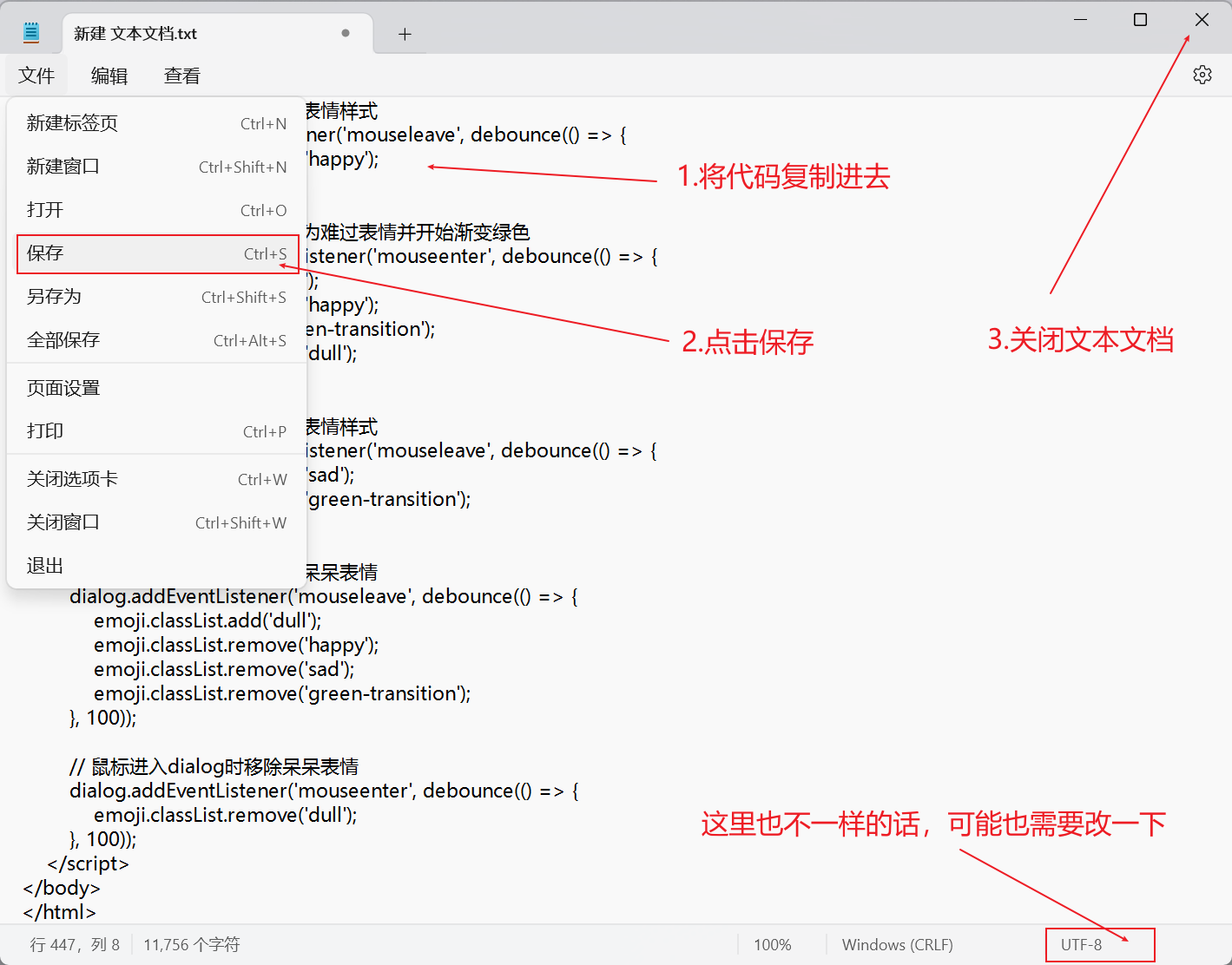
3.修改文件后缀名:将后缀名.txt改成.html

对了,后缀名小数点 . 前面的文字可以随便修改,你可以给文件改为任意名字
4.完成!
双击这个网页文件(选择浏览器打开)即可…
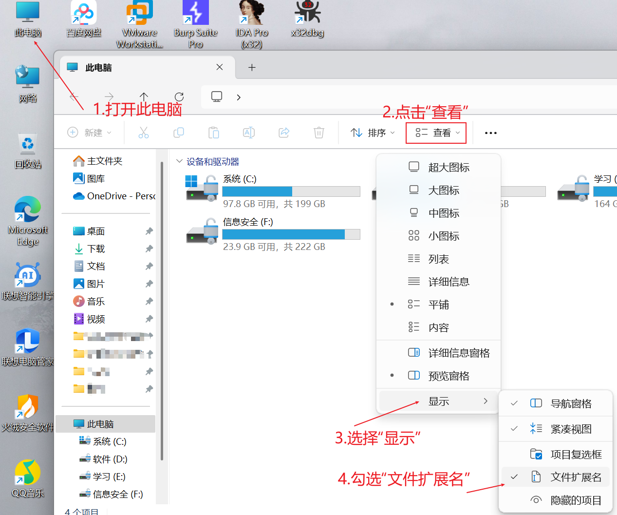
修改文件后缀名
修改文件后缀名的话很简单,我这里使用win11演示:
打开“此电脑” —> 点击“查看” —> 点击“显示” —> 点击“文件拓展名”勾选上 —> 就完成了!
然后,看一下 文本文档文件 是不是就有了 .txt 后缀名
图片演示:
来源链接:https://www.cnblogs.com/Counterattack-Hacker/p/18740759
© 版权声明
本站所有资源来自于网络,仅供学习与参考,请勿用于商业用途,否则产生的一切后果将由您(转载者)自己承担!
如有侵犯您的版权,请及时联系3500663466#qq.com(#换@),我们将第一时间删除本站数据。
如有侵犯您的版权,请及时联系3500663466#qq.com(#换@),我们将第一时间删除本站数据。
THE END


暂无评论内容